Beyond reading the lessons, listening to the CDs, and watching the instructional videos, the true value and learning in the New York Institute of Photography Professional Photography course lies within the photo assignments.
While Unit Two centered on focus and exposure, the photo project assignment was closely tied to Lesson Ten, "Developing Your Eye." Each of the three photographs for this assignment were linked to composition.
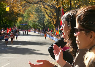
Photograph #1: Emphasizing the subject by its size and off-center placement.
"Make a horizontal photograph in which the subject is both very large and placed somewhat off to the side, following the 'Rule of Thirds.' If the subject is looking or moving in a certain direction, leave more space in front of it than behind it."
Subject: Cheering Onlookers
Location: Central Park, New York
Time of Day: 12:30pm
Metadata: ISO 200 43mm f/10 1/160
Lighting: Bright Sun
I follow the "rule of thirds" for many of my photographs without necessarily being cognizant of it. I often find the best composition just "looks right" by dividing the frame into thirds either horizontally or vertically.
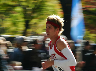
For the first photograph, I didn't necessarily go out of my way to shoot a scene with off-center placement, but my recent photo shoot at the New York City Marathon included this photograph which I took while trying to capture both the excitement of the cheering onlookers and the intensity of the runners heading toward the finish line.

Here the subject of the photograph is the two women on the right who appear to be cheering and clapping as runners go by. I'd like to think that this composition does a nice job of initially drawing your eye to the young women first and then down the road to see the action in the distance. This photo might have been even more dramatic had I been able to capture a few more runners in the foreground closer to the two women on the right.
In some ways this photo is unique in that it also plays to the next two photos within the assignment which include "framing to focus attention" and "leading lines to draw attention." For example, the trees in their autumn color do a nice job of framing the road. And the road itself draws your attention to both the crowds of fans lining the road and the runners approaching in the distance.
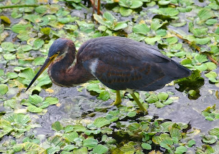
Photograph #2: Using framing to focus attention on your subject.
"Photograph an object, person, or scene, framing it with tree branches, an archway, a window, or other objects."
Subject: Tri-Colored Heron
Location: Wakodahatchee Wetlands, Delray Beach, FL
Time: 8:25am
Metadata: ISO 200 200mm f/5.6 1/200
Lighting: Morning sun
Framing is another favorite composition of mine, but in the past couple of weeks, I didn't come across many opportunities which lent themselves to the more traditional framing approach. So instead of digging up an old example, I got a little creative in the interpretation by submitting this photograph of what I believe to be a tri-colored heron taken on my visit to Wakodahatchee Wetlands last weekend.

Here the heron is framed by the leaves within the water, providing a nice contrast to the more muted gray colors of the heron. Within Lesson Ten, there is a photograph of a kitten centered in a sea of ivy which illustrates this similar framing effect.
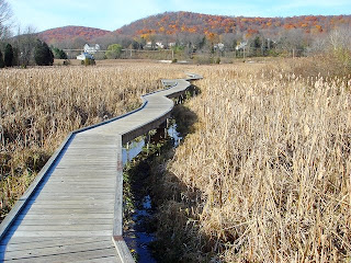
Photograph #3: Using leading lines to draw attention to your subject.
"Photograph a person or object using leading lines to guide the viewer's eye to the subject. If the subject is relatively small, be sure it contrasts well with the background."
Subject: Appalachian Trail
Location: Glenwood, NJ
Time: 3:00pm
Metadata: ISO 125 6.3mm f/5.6 1/320
Lighting: Sunny
A classic leading lines example might be a photograph of train tracks leading to a subject, or a view down a highway leading to a landscape vista in the distance. In the past couple of weeks I took many photographs which had elements of leading lines, but none that necessarily led the viewer to a distinctive subject.
The photo below was actually taken a year ago on the Appalachian Trail in Glenwood, New Jersey. I really liked the way the boardwalk zig-zagged through the field leading to the modest autumn colored hills in the distance.

Again, a more effective example of this composition would have included a subject at the far end of the boardwalk (how about a deer?) but I think the mountains in the distance are still effectively emphasized by the trail of the boardwalk leading to them.
I'll be ordering 5 X 7 prints of these photos from Mpix to submit along with my comprehension tests for Unit Two. I will soon be starting Unit Three on lighting.


